BEHIND BLNCD: The Making of a Modern Cannabis Brand September 24, 2025
Every BLNCD product begins with intention— from carefully balanced formulas to the small details that make the packaging stand out. At the center of that vision is founder Allison Vaillancourt, who built BLNCD around balance, wellness, and design, and designer Joey Heuring, who translated that vision into a clean, elevated visual identity.
Together, they’ve designed a brand that feels trusted, modern, and approachable—one that speaks to today’s cannabis consumer and reflects BLNCD’s purpose-driven roots. We sat down with Allison and Joey to talk about the story behind the name, the inspiration shaping BLNCD’s aesthetic, and the challenges (and joys) of designing in the ever-evolving cannabis space.

BLNCD is such a strong and memorable name. Can you share the story behind how you landed on it and what it represents for the brand?
Allison: When we were building the brand, it was really the products and the plant’s benefits that inspired the name. We launched with our CBD collection in 2018, and BLNCD (pronounced balanced) perfectly captured how CBD (and cannabis) work to bring the mind and body back into homeostasis, aka “balance”.
That pursuit of balance is at the heart of everything we do, from crafting wellness-driven formulas to inspiring the packaging design to the content and community we’ve built around it.
Dropping the vowels gave it a modern, uniquely ours feel (and yes, people still ask how to say it :P)
Branding often sets the tone for how people experience a product before they even try it. What vision did you have in mind for BLNCD’s look and feel from the start?
Allison: The ethos of BLNCD has always been about high-quality ingredients, intentional formulas, and natural, effective products that move away from a one-size-fits-all approach to a line that meets you where you are. From the beginning, we wanted to create a premium brand that felt trusted and elevated, where every detail mattered.
When we started BLNCD, there weren’t many women-owned cannabis brands in the space and very little innovation. Much of the market was filled with the same white-labeled products with questionable ingredients and terrible branding. We set out to change that. Not just with cleaner formulations and high manufacturing standards, but with thoughtful branding and beautiful packaging. Our goal was to appeal to the modern cannabis consumer seeking plant-based wellness solutions, without the stereotypical “stoner” vibe.
By creating most of our products in-house in our USDA-certified organic lab and sourcing hemp directly from partner farms, we could control every step from seed to shelf, ensuring uncompromising quality and consistency.
To be honest, I wanted to create a brand that appealed to me as a consumer. What I saw on the shelves at the time just didn’t. With a background in fashion, it felt natural to give BLNCD the polish of a beauty brand: cool, timeless, minimal, but still something that stands out.
For me, branding has always been about more than aesthetics. It’s about creating a cannabis + wellness lifestyle and community. Our roots are in wellness, and that perspective is reflected in everything we do. And because BLNCD is purpose-driven, we plant a tree for every order placed and support initiatives and events that align with our values.
Who is the modern cannabis user, and how does BLNCD cater to them?
The modern cannabis user might be someone who’s never tried cannabis before. They’re looking for a natural way to ease something that’s bothering them—stress, sleep, discomfort. They care about quality and ingredients and want cannabis to fit easily (and sometimes discreetly) into their everyday rituals. They also want it to feel like buying any other product, not something scary, illegal, or overwhelming. We aim to be a trusted resource for consumers new to the space.
I often think about what would make my mom or grandma feel comfortable picking something up at the store. How do we educate and talk about cannabis so it’s accessible and helps destigmatize the plant and the experience?
It’s been amazing to hear customer stories and see how broad the demographic really is. People are looking for something to help them relax and take the edge off without feeling incapacitated, and of course, it doesn’t hurt if the packaging feels beautiful and elevated.
The rise of cannabis-infused beverages has also helped legitimize the category. When you can sip on a beautiful ready-to-drink mocktail that gives you a little buzz, without any of the downsides of alcohol, it starts to normalize the whole space.
The modern cannabis consumer is more savvy, too. They’re looking for unique delivery systems, innovative formulations and distinct effects that create a memorable experience. These are all things we work hard to deliver.
BLNCD gets a lot of compliments on its branding. What do you think resonates most with people about the identity you’ve built?
Allison: I think it resonates because it looks different from anything else on the market. The design is clean and elevated, and all the little details are intentional. It feels modern and luxurious, but still approachable, so it speaks to a wider audience than the typical cannabis aesthetic.
Color is such a powerful tool in branding. How did you want color to show up in BLNCD, and what emotions or experiences were you hoping it would evoke?
Allison: Color has been a big part of our branding from the start. Each shade signifies the benefits of that product’s formulation, and as the collection grew, we built a spectrum of colors that reflect a spectrum of benefits. When we launched the THC line, we pushed the palette even further to add more vibrancy to the collection.
I’m a packaging and color nerd, so dreaming up the next shade is always one of my favorite projects. The colors are meant to feel fresh and a little unexpected, never the typical tones you see in this space, so they stand out while also evoking the mood of the product itself, whether that’s relaxation, elevation, or something in between.
BLNCD’s branding feels elevated but also approachable. How did the collaboration between you two bring that balance to life?
Joey: From the beginning, we envisioned a brand and product line that is clean, sophisticated, and purposeful. A minimalist approach that values simplicity over complexity and a palette of colors that work together in perfect balance. Collaborating with Allison is effortless, our creative flow and shared vision are what bring BLNCD to life.
Looking back, what part of BLNCD’s design or name are you most proud of?
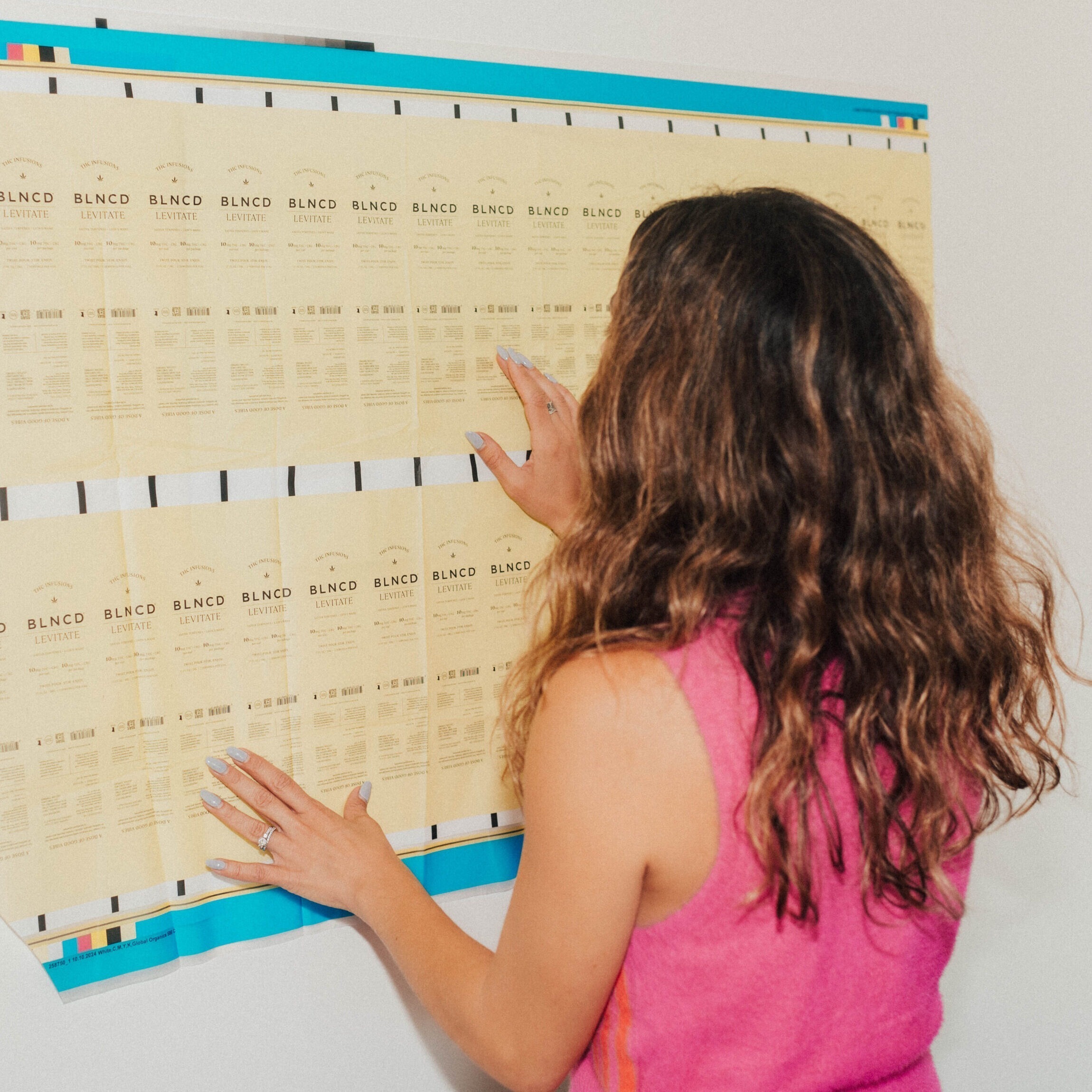
Allison: I’m obsessed with the packaging. From the textures and colors to the hidden messages and sustainable choices, every detail is intentional. I’m proud that we’ve stayed true to our ethos by prioritizing quality and resisting the pressure to cut corners so each product feels genuinely special. Creating most of our products in-house means we can protect those standards from start to finish.
What’s been the most challenging part of designing packaging in the cannabis space, where there are so many regulations to follow?
Allison: Where do I start, LOL? The trickiest part is the lack of universal packaging and labeling requirements. For example, we’ve had to update all of our product packaging three times this year alone to meet differing state requirements.
Joey: When we first started, packaging only needed a few disclaimers, but now it’s packed with information because of the constantly changing cannabis regulations. The challenge has been figuring out how to adapt while still keeping the design minimal and approachable. Striking that balance between compliance and maintaining our aesthetic has definitely been a challenge for us.
The logo is clean, bold, and instantly recognizable. Can you walk us through your process of bringing it to life?
Joey: When I designed the logo, I wanted it to feel simple, easy to read, and instantly recognizable. I paid close attention to the typography and spacing so it would have a timeless quality. For me, it was also important that it reflect the brand’s simplicity and the idea of balance behind the name BLNCD.
BLNCD’s packaging always stands out on the shelf — what were the guiding principles behind how you wanted it to look and feel in someone’s hands?
Joey: We designed the packaging to feel warm and welcoming, with colors that draw people in right away. The design is straightforward and trustworthy, without adding unnecessary complexity. We wanted the products to feel display-worthy, something people would be excited to keep on their shelves or in their fridge. Every detail has a purpose, helping the brand feel both familiar and connected.
Branding for cannabis and wellness can take many directions—what made BLNCD’s design language stand out as unique in this space?
Joey: BLNCD is about health and wellness, it’s less about just getting high and more about the real benefits of cannabis. When we started, the market felt oversaturated, and a lot of brands looked the same. We wanted to do something different: create a look that felt approachable, trustworthy, and visually inviting. The design was meant to welcome people who are new to cannabis, but still connect with regular users. With packaging that feels refined and reliable, BLNCD stands out, and ultimately the products speak for themselves.